27th May 2024

Tracklist Typography & Process

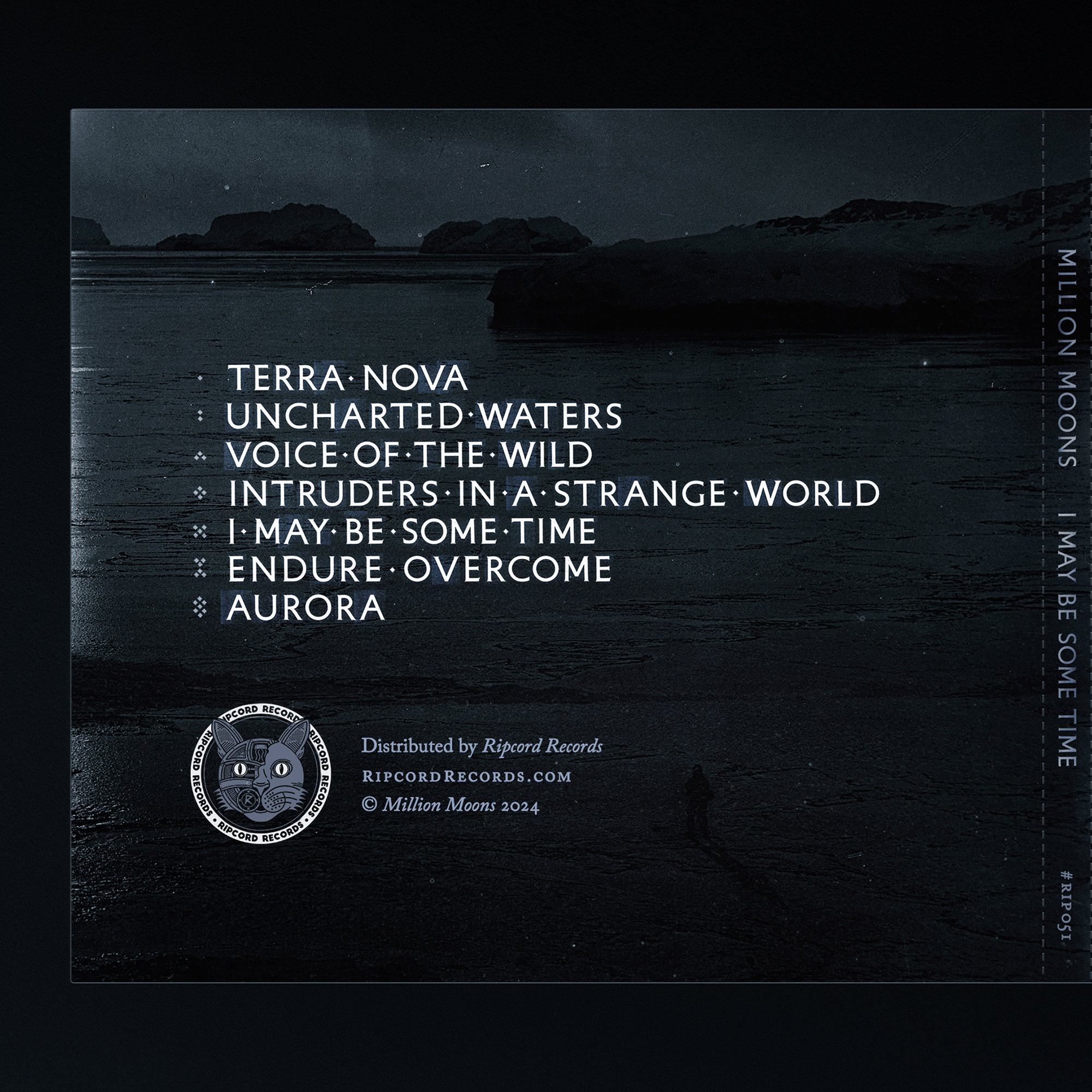
The tracklist for the I May Be Some Time album is created using a very special technique. Each letter is cut out and arranged one by one, just like they would have been with letterpress printing during the early 1900s – the same era the album is inspired by.

The process allows granular control over the letters and spacing, producing an effect that is impossible to achieve with a technically perfect computer font.

This video provides a look at how it was done:

The tracklist on the back of the CD digipak. The same technique is used on the spine.

The album (with a myriad of original artwork) will be released on July 5th.

Credits

Patron
Million Moons

Design
Herm the Younger

10th May 2022

eBook Cover

I designed the cover for Johan Qin's recently published eBook, How To Think Like A Talented Creator. Johan was seeking a design that would provide a strong visual presence for his text. Something original, captivating, and formal.

eBook Cover for "How To Think Like A Talented Creator" by Johan Qin.
Custom logotype for the author's personal branding.

Design Notes

The final cover is comprised of three components:

typography

The book's title is set in Caslon, an old English typeface which has been used in books for centuries. The serifs of this font and the classical layout add formality to the design, a key part of the brief.

background

The background comes from a much larger artwork of mine, A Sudden Vision. This ethereal backdrop was changed in every graphic to avoid its use becoming repetitive.

border

The border adds subtle decoration and frames the cover. As Johan noted, it also "makes it look like a reflective mirror, so the reader is getting an accurate reflection of themselves as a creator".

Quotes

Several key quotes were selected from the text and made into graphics. These feature throughout the book and were also used for promotion.

Every one of the 40+ quotes has a uniquely textured background. This ensures that each one is interesting in its own right, worth reading, and avoids the visual pollution caused by using the same assets over and over again.

Conclusion

By working closely with the author I was able to design a cover that sets the tone for the content and quality of the book, and the graphics which helped him to promote it.

Credits

Patron
Johan Qin

Art Direction
Herm the Younger

13th December 2019

Certificate of Authenticity

A closer look at the certificates I designed to accompany a set of three art prints I released. The envelopes were handmade from paper that matched the colour of the art print and printed with the name of each patron.

I have since refined the front design to include a wider margin (allowing space for people's thumbs and fingers when they are holding it), edition details, and other minor improvements.

Portfolio  —  About  —  Archive  —  Blog  —  Wallpapers

Herm the Younger is an artist and designer from the UK.
For inquiries and commissions please contact:
h@hermtheyounger.com